Archive for the ‘design’ Category

Wednesday, February 4th, 2015

Better recommendations: Display

Over the next week or so we’ll be talking a lot about recommendations on LibraryThing and LibraryThing for Libraries. We’ve been doing a lot of work on this part of the site, and will be rolling out a number of improvements.

Today we’re debuting a new system for showing recommendations on works.

Check it out:

  1. Recommendations page for The Fault in Our Stars
  2. Recommendations page for Archaeology and Language
  3. Work page for Code Name Verity

And come talk about it on Talk.

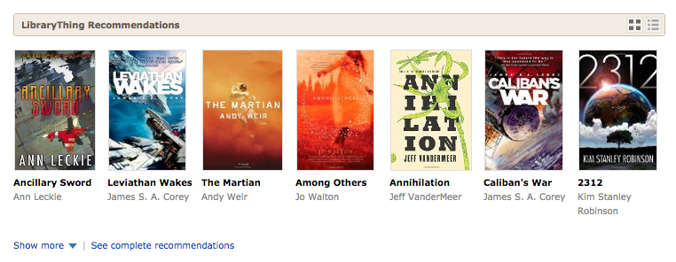
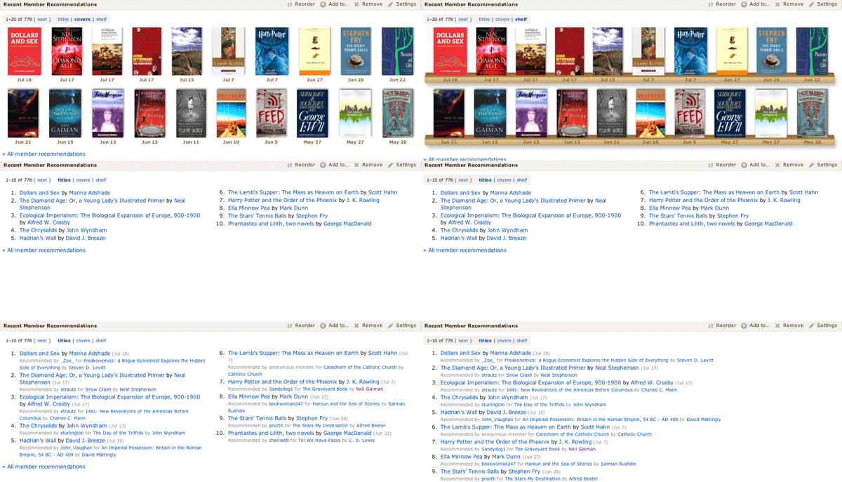
Details. The first change is to the “brief” display on work pages. We have a new way of showing a “shelf,” with both cover and title. We think this is more appealing—to more users—than the previous text-only system.

Screenshot 2015-02-04 13.51.09

You can expand to “see more,” to get two more rows, then “see all” to get ten or more. The deeper you go the less confident we are that the recommendation is a good one. But our recommendations are often quite good deep.

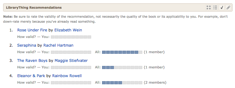
If it’s not more appealing to you, you can see the recommendations as text, with series “tucked under.”

Screenshot 2015-02-04 13.51.48

If you want to keep it that way, click the “edit” pencil. To keep the number of icons down, you’ll only get this if you click to change views. (Not everyone will like this. I do.)

Screenshot 2015-02-04 13.54.27

Besides “covers” and “text” you can also choose to vote on recommendations, as before.

Screenshot 2015-02-04 13.55.46

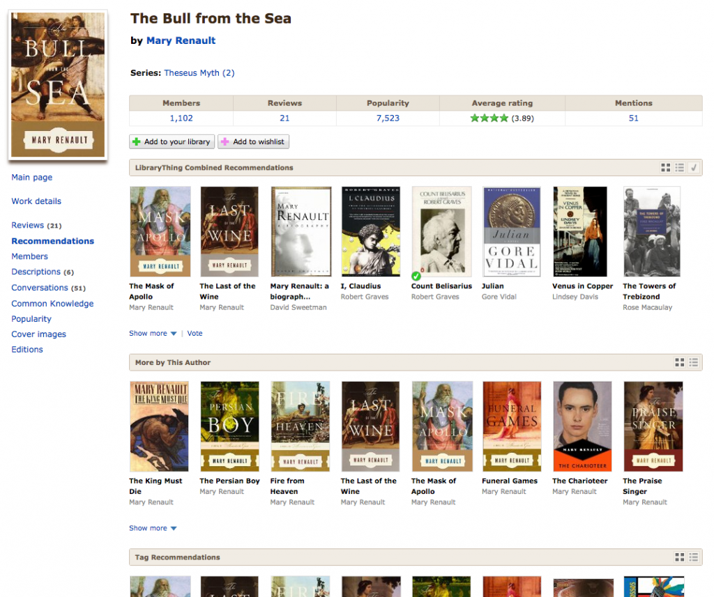
The new way of seeing recommendations has transformed the “All recommendations” subpage. (Here’s the ugly, list-y thing it looked like before.) To the various recommendation types we’ve added “More by this author,” which sorts the authors books by their algorithmic similarity to the book in quesiton, and “‘Old’ Combined Recommendations” for members seeking to compare the old algorithms with the new.

As before, this page shows all the different elements that make up LibraryThing’s “main” (or “combined”) recommendations.

Screenshot 2015-02-04 13.58.44

And come talk about it on Talk.

A note on authors and repetition. Algorithmic recommendations are something between a science and an art. There’s a lot of math involved, some of it very complex indeed. But the mathematically “right” answer isn’t much good if it’s boring. So, mathematically, one James Patterson book is statistically most similar to two dozen other James Patterson books before and other author can contribute a book. But who wants to see row after row of that?

Turning math into something stimulating and diverse, yet credible, is complex process. In this case, the same-author problem is addressed not in the initial data, but “at display,” by limiting how many times an author may appear on a given line. You can see this, for example, in the recommendations for The Fault in Our Stars, which restrains John Green from taking over, or Horns, which restrains Joe Hill, but also Steven King, Justin Cronin and others.

Because of differences in screen size, members will now sometimes be presented with slightly different recommendations lists, as books get pushed between rows. We think the drawbacks there are outweighed by the visual benefits of not overloading members wih repetitive recommendations.

Labels: design, new feature, new features, recommendations, Uncategorized

Tuesday, July 23rd, 2013

LibraryThing’s Chocolate Redesign

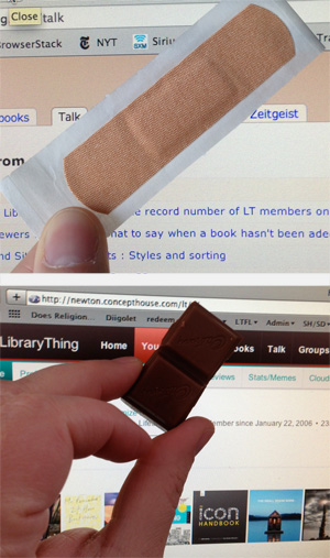
Before and after, band-aid to chocolate.

An anonymous member sent us a box of dark chocolate-covered cherries. Very appropriate, and very much appreciated!(2)

We’re rolling out lots of changes. See also The New Home Page »

You may have noticed a few changes around the site … last week we pushed live the first major redesign of the LibraryThing site in… ever!(1) The final concept and design were something of a group effort, but the vast majority of the work was done by Christopher Holland (conceptdawg). Note that the new design is separate from the new Home page, blogged about here.

New colors. The top nav bar has turned chocolate brown with red highlights. Goodbye, band-aid/dead salmon color! You’ll see other new accent colors around the site as well.

Smaller, “fixed” top nav. The top nav is 25% smaller than the old version. This means you see more content on each page without scrolling. Like many sites today, the top nav is now “fixed,” remaining at the top when you scroll down the page. This feature is disabled on mobile devices, which handle “scrolling” differently, and, by request, we’ve also made this optional. To turn it off, click this at the bottom of the page.

Profile tab. We’ve removed the “Profile” tab. But you can still get to your profile with one click from anywhere on the site: just click your member name in the upper right corner! You can also get to your profile from the “subnav” on the home page.

New comments indicator. You’ll see a small yellow box appear in the upper right corner of the site when you have a profile comment. It will now even tell you how many new comments you’ve received.

A work in progress.

We’ve begun the process of standardizing the entire site to make all of the hundreds of LT pages look nice with the new color scheme, etc. We’re not quite there yet. There’s lots of work left to do, mostly little things where the old design is still poking through. We’re hacking away at those now.

Members who joined prior to the launch of the redesign can revert to the old design for the moment. This will not be available permanently (it’s simply too much work to try and maintain two different systems), but it’s there for now.

We want your thoughts. What do you think? What do you particularly like, or dislike? Come tell us in the New design – Comments #3 Talk thread.

Found a bug? Come report it in the New design – Bugs #2 thread.

Previous threads of interest (we’re well past 1,700 posts about the design alone…)


1. For a few months LibraryThing’s color was an even more terrible greige.
2. Truth be told, 72?!? That’s over 3,800 calories!

Labels: christopher holland, design, features

Tuesday, July 23rd, 2013

The New Home Page

This blog post is the “coming-out” party of the new home page, introduced last week. After extensive discussion—over 1,000 messages—with many changes and improvements suggested and implemented, “home” is effectively done.

What’s the point? The new page is designed as a simple but rich “home” for how you use LibraryThing. It is a “central place” that puts everything in front of you and keeps you up-to-date. But since members use LibraryThing in so many different ways—cataloging, keeping track of current reads, getting new recommendations, socializing, etc.—it had to be a menu of options, and extensively customizable.

The new home page replaces the old, introduced five year ago, which had grown cluttered, long and slow. It was customizable, but limited and buggy, and many members skipped it.

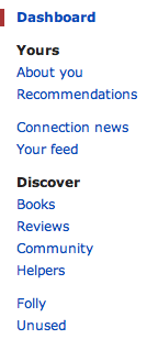
Pages and Modules. The new home page is divided into pages like “About you” and “Recommendations,” plus a main “Dashboard” area.

The pages sport 47 modules—more than twice as many as before. Modules do things like list your most recent activity, recommend books, update you on what your friends are reading, and track your contributions to the site.

Customize it. The home page was designed to start off useful, but many users will want to customize it.

  • You can reorder the modules on every page.
  • You can put the modules in one column or two, and set where the column break is.
  • You can move modules on and off your dashboard, and other home pages.
  • Every module can be customized, often extensively (see the example below).

Most members will want to focus on their dashboard—adding, deleting and reorganizing the modules until they’ve got the perfect jumping-off page for the rest of their LibraryThing.

What’s new? New modules include:

  • Member Gallery. See pictures in your gallery and add new ones from the home page.
  • Recent Member-uploaded Covers for Your Books. Keeps you up-to-date on the newest covers other members have uploaded for your books.
  • Your Notepad. Create a handy list of shortcuts or notes.
  • Your Library over Time. A cool chart showing how your LT library has grown.
  • Lists. Modules for Your Lists, Active Lists, Recent Lists, Lists You Might Like bring LibraryThing’s Lists feature in the mainstream.
  • Your Recent Reviews. Reminds you what you’ve reviewed recently.
  • Reviews for Your Books. Find out what other members are saying about your books.
  • LibraryThing Roulette. Click for a random book, author, series, etc. Weirdly addictive, and helpful for helpers.
  • Helper modules. A page with statistics and links to venue linking, work combining and the dozens of other ways LibraryThing members help each other.
  • Recent Haiku. See book summaries / by members cleverly put / in five-seven-five.
  • Thingaversaries. Members have been celebrating the anniverary of their joining LibraryThing for years; the home-page module makes that easier.

What’s improved? Along with all the new features Tim also thoroughly redesigned and streamlined many of the existing Home page modules:

  • Tag watch is back! The much-missed Tag watch feature has returned, much simpler and easier to use.
  • Recommendations now includes subsets. You can choose between top automatic recommendations, recent automatic recommendations, and recent member recommendations.
  • Dates. Recently-added books and recent recommendations now include dates, so you can see when you added a new book or when a recommendation was made for you.
  • On This Day now factors in the popularity of the authors, so it gives you the most relevant author birth- and death-days. By default it also prefers to show authors you have. There’s also a new “On this day” Common Knowledge page.
  • We redesigned the Featured Authors section (in the Books section under Discover), to show more LibraryThing authors.

Background: We also recently released a new design—out with the “band aid” or “salmon” and in with the chocolate. Staff, especially Chris (ConceptDawg) is still working on that design, tweaking color choices and making sure it works right on all the browsers and devices out there. See the design blog post for more.

The changes to the Home page are largely based on discussions in the Wide open: What to do with your home page? thread, and Tim (timspalding) had great fun coming up with the new layout and all the brand-new, nifty features that are part of this.

What do you think? Come tell us in the New home – Comments #3 Talk thread.

Find a bug? Report it in the New home – Bugs continued again thread.

Additional threads of interest:

Labels: design, features, home

Wednesday, May 22nd, 2013

Thoughts toward a LibraryThing redesign

Labels: design

Friday, April 26th, 2013

A raft of LibraryThing improvements

Our developers have made a whole slew of improvements recently. If you’re not following New Features, you may have missed them. Here’s a roundup.

The person who normally draws our yellow arrows died.

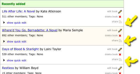
Share buttons on Add Books

We’ve added “share” buttons to the add books page, so you can share your new books on Facebook and Twitter easily. Come discuss.

Date formats and date-read changes

Change your default date format. You can now edit the way you’d like dates to appear in your catalog for the date-read, date-acquired, and entry date fields. 2013-04-26, or “YYYY-MM-DD,” is still the default, but you can change it to M/D/YYYY, or “January 1, 2012,” or several other display options. Change this setting on any book’s edit page, from Edit your profile > Account settings, or in the lightbox which appears when you edit the reading-date fields in your catalog.

“Imprecise” or “fuzzy” dates. Rather than having to enter a full year-month-day (2012-12-23) date, you can now just enter a year and a month (2012-12) or a year (2012).

Non dates and bad dates. You can even enter non-dates (“Banuary 2012” or “Sometime in college”) and the text will save and stick. It will, however, be displayed as red text. Dates from before 1970 now save correctly too.

New lightbox for editing dates. Editing reading dates from within the catalog now works slightly differently: if you double-click one of the reading date columns you’ll now see a lightbox appear, and you’ll be able to edit any reading dates for that particular book.

“Reading dates” catalog field added. We’ve added a new “Reading dates” field to Your books: this uses two columns and includes both the “Date Started” and “Date Finished” reading date fields. It sorts by the latest date in either “Date Started” or “Date Finished,” which is usually what you want. Add this to one of your display styles at http://www.librarything.com/editprofile/styles.

Back-end changes. These improvements required various important back-end changes, basically completely revising how and where the date-read data is stored. These were important not only for the improvements mentioned here, but also as we move into more changes to the “currently reading” structure (coming soon). This is step one of a multi-step process.

Questions, comments, bugs to report? Come discuss on Talk.

View, sort by work’s average rating

By popular request, we’ve adding a way for you to view or sort by a work’s average rating in your catalog. The column is called “Work: Average Rating.” Add it to one of your display styles at http://www.librarything.com/editprofile/styles. The column shows the work’s rating graphically (with stars, making it easy to compare your ratings with the average) as well as numerically, to allow more precision. The total number of ratings is also displayed.

For more on this, see the Talk thread. Over 250 members voted on how to style it, and we ended up coming up with a compromise.

Import/sync improvements galore.

With the recent influx of imports from Goodreads members and others, we took the opportunity to spend some time with our import code, and it is now much improved. There are still some major improvements to be made, but it’s running much more smoothly than before. Key changes:

Importing is much faster. You should see a marked increase in speed when it comes to processing imported files: we’ve dedicated some more processing power to handling imports, and made some speed improvements in the queue-processing code as well.

Syncing. You can now sync between Goodreads and LibraryThing accounts, allowing you to periodically update your LibraryThing library from your Goodreads account. Synced fields include reviews, ratings, date read and shelves/tags.

Bug fixes. We fixed a number of bugs in the import code. Here’s a sampling:

  • There were a number of issues with imports from Shelfari, Anobii, and Calibre that were causing all sorts of strange things to happen. Imports from those sites should now be much more successful (author names should come in completely, for example, rather than partially as they were in many cases).
  • A bug which caused collection assignments to go awry was eliminated.
  • Books which only include an ISBN-13 are now imported using the ISBN, rather than as ISBN-less books.
  • We’re now blocking any records without any data in the title field, as well as any blank rows in the imported file, from adding as blank LibraryThing book records.

Better tracking. During this process we added a number of new and very useful tracking measures on the back end so that we can monitor imports in a more coherent way and help to troubleshoot bugs much more easily.

Need to import? Head over to http://www.librarything.com/more/import and add or sync your books.

“Left-nav” standardization

As a first step in the direction of a site redesign, we’re working on standardizing various elements of the site, so they all look the same across LibraryThing. We’ve begun this process with the “left nav”—what we call LibraryThing’s secondary, left-aligned navigation menus on Talk, Groups, Recommendations and lots of other pages. Basically the code for these was the same, but a whole bunch of differences cropped up depending on which page you visited.

We’ve now standardized these based on the version previously used in Talk, with the addition of a blue “call out” bar by the item you’ve selected.

Labels: design, features, import, new feature, new features