Archive for the ‘features’ Category

Friday, November 16th, 2018

Feature Update: Sharing to Facebook

Sharing your reviews, book adds, and other LibraryThing activity got an update! To test it out head over to Your Feed and click the “Share this” link next to the action you’d like to share.

Here’s what a posted review looks like today.

The long version

In August, Facebook ended its old publishing actions API, meaning websites (like LibraryThing) that had built out features for sharing directly to Facebook had to rebuild those features from the ground up. Some sites and services, such as Twitter, simply disabled this feature.

Those of you following along on the bug report might remember that we temporarily disabled our share to Facebook feature, too. LibraryThing’s developers (especially Chris C.) spent the last couple months rebuilding our Facebook sharing capability.

How to use it

Sign in to LibraryThing and go to Your Feed by clicking the “Share” link in the upper right corner of any page. Or post or update a book review, and tick the “Facebook” box next to “Share on” before hitting “Save review.”

If you’re not already logged into Facebook, you’ll be prompted to sign in, otherwise, you’ll see your post draft appear right away.

Posting a review links directly to the reviews page, with yours appearing at the top. Sharing a book you’ve added will link to your unique book page.

What’s new?

Review text: previously, we were unable to pull the text of members’ reviews into the body of the post itself. The link showed a snippet of your review (and it still does), but your rating and the full text wouldn’t be visible. We’ve fixed that. You can opt to show that rating and review text (like the screenshot above), or click the ‘x’ while composing your post to show only the link and snippet, like so.

Linked accounts

Linking your LibraryThing and Facebook accounts is no longer required to share things to Facebook. This feature is still useful for finding Facebook friends (see Friend Finder below) who are also on LibraryThing, but it has no effect on whether or what you can share from LibraryThing to Facebook.

You can still link or un-link your accounts here.

Friend Finder

Find out which of your Facebook and/or Twitter friends are on LibraryThing, too! Use the Friend Finder to see your friends on LibraryThing, and send invites to those who aren’t.

What’s next?

We’re still working on improving the cover images that display with sharing book adds.

We also want to hear from you—try it out, and tell us what you think on Talk.

Labels: facebook, features

Wednesday, June 17th, 2015

New Feature: Take Inventory

UPDATE: It’s been a big day here at LibraryThing. We’ve now added barcode support for your catalog. Read below or see the blog post for more info on that.

Take Inventory, the best name we could come up with(1), is designed to help members check their physical collections against their LibraryThing catalog. It can be used to see what books have gone missing, or, because a failed search produces a link to add the book, to check that everything in your library has actually been cataloged.

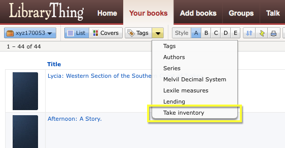
Here’s where to get it:(2)

catalog_menu

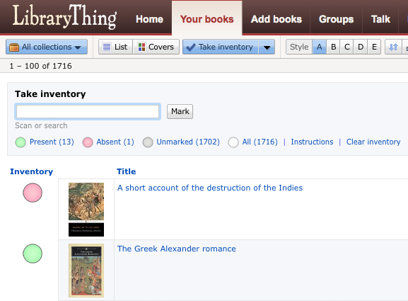
Here’s Taking Inventory in action:

inventory

Note that clicking the big, colored circles changes the inventory status(3).

The feature is designed for either manual searching or scanning with a barcode scanner, like our CueCats. You can scan either the ISBN barcode or your own barcode, if you’ve turned on the new barcodes feature for your library. The “flow” is such that you can scan books one after another, without touching the keyboard. Scanning a book marks it as “present.”

If you prefer to type in your searches, it assumes that, if one only one book appears, you want that marked as “present.” (If you don’t, you can click the large inventory circle to change it.) If multiple items show up, you’ll have to mark each one manually. If nothing comes up, you can click to go to Add Books and search for it.

Our original plan was to have this feature on a separate page, but having it within the regular catalog, with the ability to change other fields and sort the data differently gives this method particular power. Note that you can add the Inventory column outside of the “Take Inventory” functionality itself.

This feature was programmed by me (TimSpalding). Chris (ConceptDawg) worked out the color-circles interface.

Come discuss the feature on Talk.


1. The choice of name was exceedingly vexing. I asked both librarians and bookstore people on Twitter, and no consensus emerged. Other options included “shelf read,” “shelf check,” “stock check,” “stock take” and even “section report”!
2. Note that we’ve gotten rid of the special and somewhat odd Tags box. Tags can now be found with all the other pages under the menu it formerly touched. We’re still mulling this over.
3. We like the functionality, but we’re not entirely sure everyone will get this. Your thoughts?

Labels: features, new features, small libraries

Friday, January 10th, 2014

New Feature: Spoiler Alert!

To accompany the next few rounds of One LibraryThing, One Book, we’ve rolled out another nifty feature that’s been requested for quite some time now: a spoiler tag. Use it throughout OLOB discussion, and anywhere you deem necessary on LibraryThing.

How does it work?

All you have to do is enclose the spoiler-y text in a “spoiler” tag, like so:

“And the real murderer was actually <spoiler>you</spoiler> all along!”

Your result will look like this:

“And the real murderer was actually you all along!”

If you’re desperate to share what happened at the end of a good book, but don’t want to give too much away, just wrap the sensitive lines in a spoiler tag. You’ll avoid unintentionally ruining someone’s read-through (and if they do actually click on it, well, they’ve had fair warning).

Questions? Comments?

Let us know over on Talk.

Labels: features, new features

Tuesday, July 23rd, 2013

LibraryThing’s Chocolate Redesign

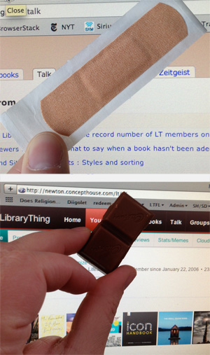
Before and after, band-aid to chocolate.

An anonymous member sent us a box of dark chocolate-covered cherries. Very appropriate, and very much appreciated!(2)

We’re rolling out lots of changes. See also The New Home Page »

You may have noticed a few changes around the site … last week we pushed live the first major redesign of the LibraryThing site in… ever!(1) The final concept and design were something of a group effort, but the vast majority of the work was done by Christopher Holland (conceptdawg). Note that the new design is separate from the new Home page, blogged about here.

New colors. The top nav bar has turned chocolate brown with red highlights. Goodbye, band-aid/dead salmon color! You’ll see other new accent colors around the site as well.

Smaller, “fixed” top nav. The top nav is 25% smaller than the old version. This means you see more content on each page without scrolling. Like many sites today, the top nav is now “fixed,” remaining at the top when you scroll down the page. This feature is disabled on mobile devices, which handle “scrolling” differently, and, by request, we’ve also made this optional. To turn it off, click this at the bottom of the page.

Profile tab. We’ve removed the “Profile” tab. But you can still get to your profile with one click from anywhere on the site: just click your member name in the upper right corner! You can also get to your profile from the “subnav” on the home page.

New comments indicator. You’ll see a small yellow box appear in the upper right corner of the site when you have a profile comment. It will now even tell you how many new comments you’ve received.

A work in progress.

We’ve begun the process of standardizing the entire site to make all of the hundreds of LT pages look nice with the new color scheme, etc. We’re not quite there yet. There’s lots of work left to do, mostly little things where the old design is still poking through. We’re hacking away at those now.

Members who joined prior to the launch of the redesign can revert to the old design for the moment. This will not be available permanently (it’s simply too much work to try and maintain two different systems), but it’s there for now.

We want your thoughts. What do you think? What do you particularly like, or dislike? Come tell us in the New design – Comments #3 Talk thread.

Found a bug? Come report it in the New design – Bugs #2 thread.

Previous threads of interest (we’re well past 1,700 posts about the design alone…)


1. For a few months LibraryThing’s color was an even more terrible greige.
2. Truth be told, 72?!? That’s over 3,800 calories!

Labels: christopher holland, design, features

Tuesday, July 23rd, 2013

The New Home Page

This blog post is the “coming-out” party of the new home page, introduced last week. After extensive discussion—over 1,000 messages—with many changes and improvements suggested and implemented, “home” is effectively done.

What’s the point? The new page is designed as a simple but rich “home” for how you use LibraryThing. It is a “central place” that puts everything in front of you and keeps you up-to-date. But since members use LibraryThing in so many different ways—cataloging, keeping track of current reads, getting new recommendations, socializing, etc.—it had to be a menu of options, and extensively customizable.

The new home page replaces the old, introduced five year ago, which had grown cluttered, long and slow. It was customizable, but limited and buggy, and many members skipped it.

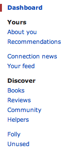
Pages and Modules. The new home page is divided into pages like “About you” and “Recommendations,” plus a main “Dashboard” area.

The pages sport 47 modules—more than twice as many as before. Modules do things like list your most recent activity, recommend books, update you on what your friends are reading, and track your contributions to the site.

Customize it. The home page was designed to start off useful, but many users will want to customize it.

  • You can reorder the modules on every page.
  • You can put the modules in one column or two, and set where the column break is.
  • You can move modules on and off your dashboard, and other home pages.
  • Every module can be customized, often extensively (see the example below).

Most members will want to focus on their dashboard—adding, deleting and reorganizing the modules until they’ve got the perfect jumping-off page for the rest of their LibraryThing.

What’s new? New modules include:

  • Member Gallery. See pictures in your gallery and add new ones from the home page.
  • Recent Member-uploaded Covers for Your Books. Keeps you up-to-date on the newest covers other members have uploaded for your books.
  • Your Notepad. Create a handy list of shortcuts or notes.
  • Your Library over Time. A cool chart showing how your LT library has grown.
  • Lists. Modules for Your Lists, Active Lists, Recent Lists, Lists You Might Like bring LibraryThing’s Lists feature in the mainstream.
  • Your Recent Reviews. Reminds you what you’ve reviewed recently.
  • Reviews for Your Books. Find out what other members are saying about your books.
  • LibraryThing Roulette. Click for a random book, author, series, etc. Weirdly addictive, and helpful for helpers.
  • Helper modules. A page with statistics and links to venue linking, work combining and the dozens of other ways LibraryThing members help each other.
  • Recent Haiku. See book summaries / by members cleverly put / in five-seven-five.
  • Thingaversaries. Members have been celebrating the anniverary of their joining LibraryThing for years; the home-page module makes that easier.

What’s improved? Along with all the new features Tim also thoroughly redesigned and streamlined many of the existing Home page modules:

  • Tag watch is back! The much-missed Tag watch feature has returned, much simpler and easier to use.
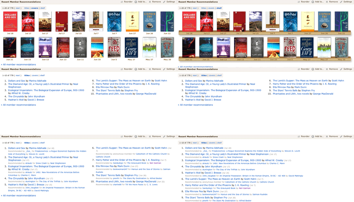
  • Recommendations now includes subsets. You can choose between top automatic recommendations, recent automatic recommendations, and recent member recommendations.
  • Dates. Recently-added books and recent recommendations now include dates, so you can see when you added a new book or when a recommendation was made for you.
  • On This Day now factors in the popularity of the authors, so it gives you the most relevant author birth- and death-days. By default it also prefers to show authors you have. There’s also a new “On this day” Common Knowledge page.
  • We redesigned the Featured Authors section (in the Books section under Discover), to show more LibraryThing authors.

Background: We also recently released a new design—out with the “band aid” or “salmon” and in with the chocolate. Staff, especially Chris (ConceptDawg) is still working on that design, tweaking color choices and making sure it works right on all the browsers and devices out there. See the design blog post for more.

The changes to the Home page are largely based on discussions in the Wide open: What to do with your home page? thread, and Tim (timspalding) had great fun coming up with the new layout and all the brand-new, nifty features that are part of this.

What do you think? Come tell us in the New home – Comments #3 Talk thread.

Find a bug? Report it in the New home – Bugs continued again thread.

Additional threads of interest:

Labels: design, features, home