Over the next week or so we’ll be talking a lot about recommendations on LibraryThing and LibraryThing for Libraries. We’ve been doing a lot of work on this part of the site, and will be rolling out a number of improvements.
Today we’re debuting a new system for showing recommendations on works.
Check it out:
- Recommendations page for The Fault in Our Stars
- Recommendations page for Archaeology and Language
- Work page for Code Name Verity
And come talk about it on Talk.
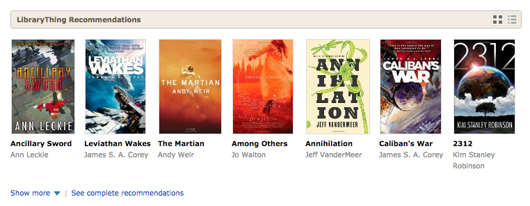
Details. The first change is to the “brief” display on work pages. We have a new way of showing a “shelf,” with both cover and title. We think this is more appealing—to more users—than the previous text-only system.
You can expand to “see more,” to get two more rows, then “see all” to get ten or more. The deeper you go the less confident we are that the recommendation is a good one. But our recommendations are often quite good deep.
If it’s not more appealing to you, you can see the recommendations as text, with series “tucked under.”
If you want to keep it that way, click the “edit” pencil. To keep the number of icons down, you’ll only get this if you click to change views. (Not everyone will like this. I do.)
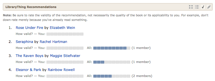
Besides “covers” and “text” you can also choose to vote on recommendations, as before.
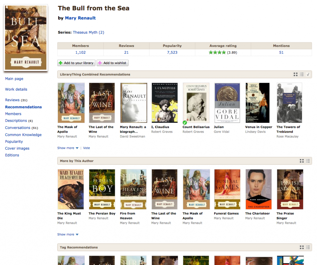
The new way of seeing recommendations has transformed the “All recommendations” subpage. (Here’s the ugly, list-y thing it looked like before.) To the various recommendation types we’ve added “More by this author,” which sorts the authors books by their algorithmic similarity to the book in quesiton, and “‘Old’ Combined Recommendations” for members seeking to compare the old algorithms with the new.
As before, this page shows all the different elements that make up LibraryThing’s “main” (or “combined”) recommendations.
And come talk about it on Talk.
A note on authors and repetition. Algorithmic recommendations are something between a science and an art. There’s a lot of math involved, some of it very complex indeed. But the mathematically “right” answer isn’t much good if it’s boring. So, mathematically, one James Patterson book is statistically most similar to two dozen other James Patterson books before and other author can contribute a book. But who wants to see row after row of that?
Turning math into something stimulating and diverse, yet credible, is complex process. In this case, the same-author problem is addressed not in the initial data, but “at display,” by limiting how many times an author may appear on a given line. You can see this, for example, in the recommendations for The Fault in Our Stars, which restrains John Green from taking over, or Horns, which restrains Joe Hill, but also Steven King, Justin Cronin and others.
Because of differences in screen size, members will now sometimes be presented with slightly different recommendations lists, as books get pushed between rows. We think the drawbacks there are outweighed by the visual benefits of not overloading members wih repetitive recommendations.
Labels: design, new feature, new features, recommendations, Uncategorized


I’d like to know at least a little bit about the book’s subject, starting with fiction or non-fiction. Romance, Si-fi fantasy, mystery, horror, vampires, thriller, erotic, historical, period (which period), etc… at the very least. Or some way to click and look at a synopsis, The title and/or cover can be very misleading. I could make a list and check them out on amazon, but that is very time-consuming.
Maybe this can be done and I don’t know how…
Thanks, Kay
Big thumbs up to the LT team from me !
I don’t know if this is related to your work on recommendation book covers, but my ‘recent additions’ display of covers has stopped displaying about half of the covers for the last dozen or so books I have added. They used to display, but now they come up blank! I experimented with changing the cover of one of the books, but it still gave me a blank display. Any suggestions?
Ah, I see what’s going on. If I choose an Amazon cover, all is fine (though it changes the ISBN). If I choose a cover that I’ve uploaded, it’s fine as long as I keep the cover image on my tablet. But, if I delete the image from my tablet, the cover displayed on LT is blank again. You don’t really upload the cover image; you just keep a pointer to the file on my tablet.
We are trying to enter audiovisuals…..DVD’s and Video cassettes….
and have not been successful at cataloging them
Is there any way to enter them…….if so please advise
Thank you
Octavio
I don’t think the new algorithm is an improvement. Previously, it seemed to work quite well at not swamping my recommendations list with series and spin-offs, and keeping it mainly focused on “primary” books (i.e. books that stand by themselves, not secondary books like companion guides, spin-offs or sequels).
It also included lots of authors I hadn’t read, which is what you look for from a recommendations service at the end of the day.
Now, because I own a few Granta collections, my top 5 reads like this:
1. Granta 127: Japan by Yuka Igarashi
2. Granta 122: Betrayal by John Freeman
3. Granta 125: After the War by John Freeman
4. Granta 128: American Wild (Magazine of New Writing) by
5. Granta 129: Fate (Magazine of New Writing) by Sigrid Rausing
If you’re dead-set on the new algorithm, can we perhaps have a button that says “stop making recommendations based on this book”, or similar?