
We’re rolling out lots of changes. See also The New Home Page »
You may have noticed a few changes around the site … last week we pushed live the first major redesign of the LibraryThing site in… ever!(1) The final concept and design were something of a group effort, but the vast majority of the work was done by Christopher Holland (conceptdawg). Note that the new design is separate from the new Home page, blogged about here.
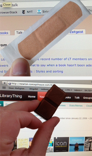
New colors. The top nav bar has turned chocolate brown with red highlights. Goodbye, band-aid/dead salmon color! You’ll see other new accent colors around the site as well.
Smaller, “fixed” top nav. The top nav is 25% smaller than the old version. This means you see more content on each page without scrolling. Like many sites today, the top nav is now “fixed,” remaining at the top when you scroll down the page. This feature is disabled on mobile devices, which handle “scrolling” differently, and, by request, we’ve also made this optional. To turn it off, click this at the bottom of the page.

Profile tab. We’ve removed the “Profile” tab. But you can still get to your profile with one click from anywhere on the site: just click your member name in the upper right corner! You can also get to your profile from the “subnav” on the home page.
New comments indicator. You’ll see a small yellow box appear in the upper right corner of the site when you have a profile comment. It will now even tell you how many new comments you’ve received.

A work in progress.
We’ve begun the process of standardizing the entire site to make all of the hundreds of LT pages look nice with the new color scheme, etc. We’re not quite there yet. There’s lots of work left to do, mostly little things where the old design is still poking through. We’re hacking away at those now.
Members who joined prior to the launch of the redesign can revert to the old design for the moment. This will not be available permanently (it’s simply too much work to try and maintain two different systems), but it’s there for now.
We want your thoughts. What do you think? What do you particularly like, or dislike? Come tell us in the New design – Comments #3 Talk thread.
Found a bug? Come report it in the New design – Bugs #2 thread.
Previous threads of interest (we’re well past 1,700 posts about the design alone…)
- New design – Comments #1
- New design – Comments #2
- New design – Bugs #1
- Home/Design: Two columns and a scrolling header
1. For a few months LibraryThing’s color was an even more terrible greige.
2. Truth be told, 72?!? That’s over 3,800 calories!


