This blog post is the “coming-out” party of the new home page, introduced last week. After extensive discussion—over 1,000 messages—with many changes and improvements suggested and implemented, “home” is effectively done.
What’s the point? The new page is designed as a simple but rich “home” for how you use LibraryThing. It is a “central place” that puts everything in front of you and keeps you up-to-date. But since members use LibraryThing in so many different ways—cataloging, keeping track of current reads, getting new recommendations, socializing, etc.—it had to be a menu of options, and extensively customizable.
The new home page replaces the old, introduced five year ago, which had grown cluttered, long and slow. It was customizable, but limited and buggy, and many members skipped it.
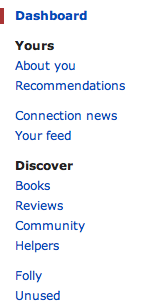
Pages and Modules. The new home page is divided into pages like “About you” and “Recommendations,” plus a main “Dashboard” area.
The pages sport 47 modules—more than twice as many as before. Modules do things like list your most recent activity, recommend books, update you on what your friends are reading, and track your contributions to the site.
Customize it. The home page was designed to start off useful, but many users will want to customize it.
- You can reorder the modules on every page.
- You can put the modules in one column or two, and set where the column break is.
- You can move modules on and off your dashboard, and other home pages.
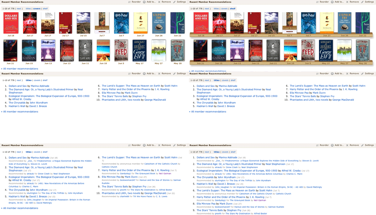
- Every module can be customized, often extensively (see the example below).
Most members will want to focus on their dashboard—adding, deleting and reorganizing the modules until they’ve got the perfect jumping-off page for the rest of their LibraryThing.
What’s new? New modules include:
- Member Gallery. See pictures in your gallery and add new ones from the home page.
- Recent Member-uploaded Covers for Your Books. Keeps you up-to-date on the newest covers other members have uploaded for your books.
- Your Notepad. Create a handy list of shortcuts or notes.
- Your Library over Time. A cool chart showing how your LT library has grown.
- Lists. Modules for Your Lists, Active Lists, Recent Lists, Lists You Might Like bring LibraryThing’s Lists feature in the mainstream.
- Your Recent Reviews. Reminds you what you’ve reviewed recently.
- Reviews for Your Books. Find out what other members are saying about your books.
- LibraryThing Roulette. Click for a random book, author, series, etc. Weirdly addictive, and helpful for helpers.
- Helper modules. A page with statistics and links to venue linking, work combining and the dozens of other ways LibraryThing members help each other.
- Recent Haiku. See book summaries / by members cleverly put / in five-seven-five.
- Thingaversaries. Members have been celebrating the anniverary of their joining LibraryThing for years; the home-page module makes that easier.
What’s improved? Along with all the new features Tim also thoroughly redesigned and streamlined many of the existing Home page modules:
- Tag watch is back! The much-missed Tag watch feature has returned, much simpler and easier to use.
- Recommendations now includes subsets. You can choose between top automatic recommendations, recent automatic recommendations, and recent member recommendations.
- Dates. Recently-added books and recent recommendations now include dates, so you can see when you added a new book or when a recommendation was made for you.
- On This Day now factors in the popularity of the authors, so it gives you the most relevant author birth- and death-days. By default it also prefers to show authors you have. There’s also a new “On this day” Common Knowledge page.
- We redesigned the Featured Authors section (in the Books section under Discover), to show more LibraryThing authors.
Background: We also recently released a new design—out with the “band aid” or “salmon” and in with the chocolate. Staff, especially Chris (ConceptDawg) is still working on that design, tweaking color choices and making sure it works right on all the browsers and devices out there. See the design blog post for more.
The changes to the Home page are largely based on discussions in the Wide open: What to do with your home page? thread, and Tim (timspalding) had great fun coming up with the new layout and all the brand-new, nifty features that are part of this.
What do you think? Come tell us in the New home – Comments #3 Talk thread.
Find a bug? Report it in the New home – Bugs continued again thread.
Additional threads of interest:


0 Comments: